





Outline
- Introduction
- What is Plotly?
- How Plotly is Revolutionizing Data Visualization
- Core Components of Plotly
- Applications Across Industries
- Advantages of Using Plotly
- Alternatives to Plotly
- Getting Started with Plotly
- Conclusion
Introduction
In today’s data-driven world, the ability to visualize and interpret complex datasets is more crucial than ever. Plotly has emerged as a leading platform that empowers individuals and organizations to create interactive, AI-enhanced data visualizations and applications. With over a decade of innovation, Plotly continues to redefine how professionals interact with data, offering tools that combine simplicity, flexibility, and intelligence.
What is Plotly?
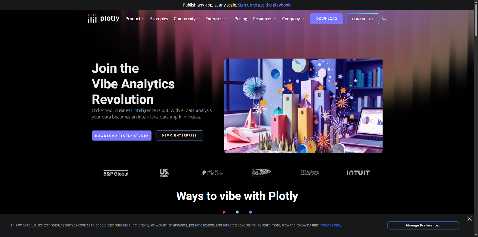
Plotly is an open-source graphing library and enterprise-grade analytics platform that allows users to build interactive visualizations, dashboards, and data applications. Founded in 2013, Plotly gained recognition for its Python-based visualization library, which integrates seamlessly with popular data science tools such as Python, Jupyter Notebook, and Pandas. The company has since expanded its offerings to include AI-driven solutions like Plotly Studio and Dash Enterprise, enabling users to turn raw data into actionable insights within minutes.
How Plotly is Revolutionizing Data Visualization
Traditional business intelligence tools often require extensive coding or manual configuration. Plotly changes this paradigm by integrating artificial intelligence into every step of the visualization process. With its new agentic analytics approach, users can generate complete data applications using natural language prompts. This means that even non-technical users can create sophisticated dashboards without writing a single line of code.
According to Plotly’s official resources, their AI-powered system can transform datasets into interactive applications in under two minutes. This speed and efficiency make it a preferred choice for organizations seeking to accelerate their data workflows while maintaining accuracy and visual appeal.
Core Components of Plotly
1. Plotly Studio
Plotly Studio is an AI-driven environment that automates the process of creating data visualizations. It can analyze datasets, generate multiple visualization options, and even suggest improvements. Users can tweak the generated visuals, rearrange layouts, and publish them directly to the cloud. This feature-rich environment eliminates the need for complex formulas or manual design steps, making it ideal for analysts and business users alike.
2. Dash Enterprise
Dash Enterprise is Plotly’s enterprise-grade platform for deploying and managing data applications. It supports both self-hosted and managed deployments, allowing organizations to scale their analytics infrastructure securely. Dash Enterprise integrates seamlessly with existing data pipelines, enabling thousands of users to collaborate on analytics projects across departments.
3. Plotly Graphing Libraries
Plotly’s open-source graphing libraries are available for multiple programming languages, including Python, R, Julia, and JavaScript. These libraries provide developers with the flexibility to create custom visualizations that can be embedded into web applications or dashboards. The libraries support a wide range of chart types, such as scatter plots, bar charts, heatmaps, and 3D visualizations.
Applications Across Industries
Plotly’s versatility allows it to be used across a wide range of industries. Below are some real-world applications:
- Finance: Analysts use Plotly to visualize stock trends, portfolio performance, and risk models.
- Healthcare: Researchers employ Plotly dashboards to track patient data, analyze clinical trials, and visualize genomic information.
- Manufacturing: Engineers use Plotly to monitor production metrics, equipment performance, and supply chain analytics.
- Education: Educators integrate Plotly into interactive learning modules to teach data science and statistics.
- Government: Agencies use Plotly to visualize census data, monitor environmental metrics, and improve transparency through open data initiatives.
Advantages of Using Plotly
Plotly offers several advantages that make it a top choice for data professionals:
- Interactivity: Unlike static charts, Plotly visualizations are fully interactive, allowing users to zoom, hover, and filter data in real time.
- AI Integration: The platform’s AI capabilities simplify complex analysis tasks, making data exploration faster and more intuitive.
- Cross-Language Support: Developers can use Plotly with multiple programming languages, ensuring flexibility and interoperability.
- Cloud Deployment: With Plotly Cloud, users can easily publish and share their dashboards with teammates or clients.
- Open-Source Foundation: The open-source nature of Plotly’s libraries encourages community contributions and transparency.
Alternatives to Plotly
While Plotly stands out for its AI-driven analytics and interactivity, several other tools offer strong visualization and dashboarding capabilities. Below is a comparison of some popular alternatives:
| Tool Name | Description |
|---|---|
| Power BI | A business analytics service by Microsoft that provides interactive visualizations and business intelligence capabilities with a simple interface for end users. |
| Tableau | A leading data visualization platform that helps users transform raw data into understandable dashboards and reports. |
| Looker Studio | Google’s free tool for creating customizable data dashboards and reports integrated with various data sources. |
| Apache Superset | An open-source data exploration and visualization platform designed for modern data teams. |
| Metabase | A user-friendly, open-source business intelligence tool that allows teams to visualize data without SQL expertise. |
Getting Started with Plotly
Getting started with Plotly is straightforward, whether you are a developer or a business analyst. Here’s a step-by-step guide:
- Step 1: Install the Plotly library using pip (
pip install plotly) if you are using Python. - Step 2: Import the library into your development environment and load your dataset.
- Step 3: Use Plotly’s built-in functions to create visualizations such as scatter plots, bar charts, or line graphs.
- Step 4: Customize your charts by adjusting colors, labels, and interactivity settings.
- Step 5: Deploy your visualization using Dash or publish it via Plotly Cloud for collaboration.
For organizations, integrating Dash Enterprise enables secure deployment and governance of analytics applications at scale. This ensures compliance with enterprise security standards while maintaining flexibility for data scientists and developers.
Real-World Impact
Plotly’s impact extends beyond visualization. It has become a catalyst for innovation in AI-driven analytics. Data scientists like Arich Knaub have praised Plotly for its ability to spark new ideas and streamline workflows. According to user testimonials, Plotly Studio can generate multiple data prompts and visuals automatically, reducing reporting time from hours to minutes. This efficiency allows teams to focus on strategic decision-making rather than manual data preparation.
Moreover, organizations deploying Dash Enterprise have reported faster development cycles for client-facing applications. By leveraging Plotly’s robust framework, companies can reduce engineering overhead while enhancing performance and scalability.
Conclusion
Plotly has redefined the landscape of data visualization and analytics through its combination of AI, interactivity, and open-source innovation. Whether you are a data scientist, analyst, or business leader, Plotly offers tools that simplify complex analysis and empower users to make data-driven decisions with confidence. Its seamless integration with modern data ecosystems and its commitment to accessibility make it a cornerstone of the modern analytics stack.
As organizations continue to embrace AI and automation, platforms like Plotly will play an increasingly vital role in transforming raw data into meaningful insights. With its powerful suite of tools, Plotly stands not only as a visualization platform but as a comprehensive ecosystem for the future of intelligent data analytics.